


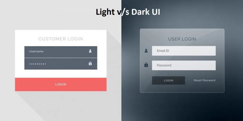
 The majority of individuals favor dark themes due of their coolness. It makes the background of an interface look like dark surfaces. Dark themes reduce the amount of light emitted by device screens while preserving minimum color contrast ratios. In contrast to light themes, they reduce eye strain, adjust brightness to the lighting conditions, and make it simpler to use devices in low light. They also preserve battery life. We can add the ability to switch between light and dark themes on our websites using only our understanding of HTML, CSS, and Javascript.
In this article, we’ll provide a soft introduction to CSS variables and how they can be used to create a light and dark theme for our websites. Let's get started with introduction to CSS variables
What are CSS Variables
Variables are names that store values. In CSS, they are called custom properties that help reduce repetition and inconsistencies in CSS. They also allow values to be stored in one place, then referenced in multiple other places.
How to declare CSS variables
Variables in CSS are declared using custom property notation, variable name must begin with two dashes (--) and is case sensitive!
--main-color: black;
While they are accessed in any element selector using the var() function.
color: var(--main-color);
CSS variables can be declared within a CSS selector in two different scopes which are global scope and local scope.
For a global scope, variables can be accessed in multiple places after being declared. You can use either the :root or the body selector.
:root {
  --main-color: black;
  --second-color: blue;
}
.container {
  background-color: var( --main-color);
  padding: 15px;
}
For local scope, variables can only be accessed inside the selector they are being declared. they cannot be referenced to outside the selector.
.container {
  --main-color: black;
  background-color: var( --main-color);
  padding: 15px;
}
CSS Variables Inheritance
Similar to normal CSS, variables in CSS can override and inherit. This means that if a custom property on a given element does not have a value set for it, the value of the element's parent will be used instead, and if a value is set for the same property on an element, the new value will take precedence over the parent value. Example:
:root {
 --main-color: black;
  --padding: 1rem;
}
.one {
  padding: var(--padding);
  background-color: var( --main-color);
}
.two {
  --padding: 1.5rem;
  padding: var(--padding);
  background-color: var( --main-color);
}
In the above example, element selectors one and two will inherit the global main color because it does not have another value set for it, while element selector two will have a different padding size because the new value assigned will override the global padding.
CSS Variables Fallback
CSS variables can have a fallback value for when our variable is not declared. For example, if we want to change our body's background color and we want the background color to be dependent on a variable called bgcolor. Since there is no bgcolor declared above, it should fallback to color pink.
body{
   background-color: var(--bgcolor, pink);
}
`
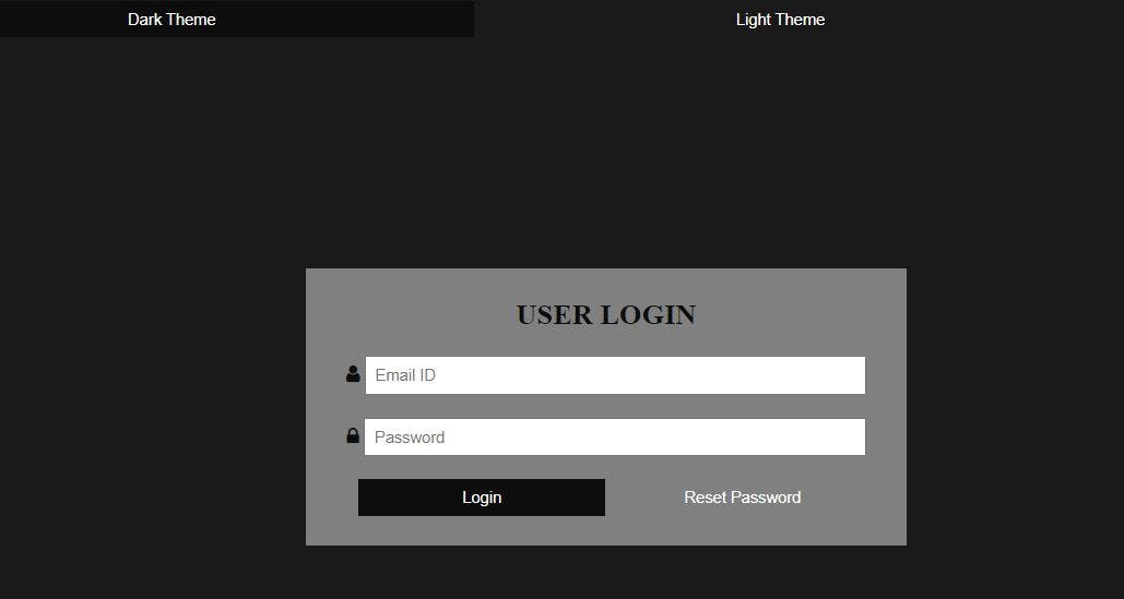
Let's start to create a login page that we can alternate from dark theme to light theme. Let's have an html file
<div class="container">
     <div class="theme">
       <button id="dark-theme">Dark Theme</button>
        <button id="light-theme">Light Theme</button>
     </div>

    <div class="login">
        <h2>USER LOGIN</h2>
        <form>
           <div class="input-email">
             <i class="fa fa-user"></i>
              <input type="text" placeholder="Email ID">
           </div>
           <div class="input-email">
             <i class="fa fa-lock"></i>
              <input type="password" placeholder="Password">
            </div>
            <button>Login</button>
            <button>Reset Password</button>
        </form>
     </div>
</div>
We can style our page using this CSS code
 :root{
    --background-color: #1a1a1a ;
    --margin: 10px;
    --form-padding: 8px;
}
body{
    background-color: var(--background-color);
}
.login{
    width: 500px;
    background-color:  #808080;
    text-align: center;
    margin: 12rem auto 0;
    padding: 5px 0px 25px;
}
input{
   padding: var(--form-padding);
   width: 80%;outline: none;
}
button{
    width: 41%;
    padding: var(--form-padding);
    background-color: transparent;
    border: none;color: #fff;
}
button:hover{
    background-color: #0d0d0d;
}
With the Javascript code below, we can change the css property when dark theme and light theme buttons are clicked.
document.getElementById('dark-theme').addEventListener('click', () =>{
     document.documentElement.style.setProperty('--background-color', '#1a1a1a')
})
 document.getElementById('light-theme').addEventListener('click', () =>{
      document.documentElement.style.setProperty('--background-color', ' #bfbfbf')
})
In the end, we'll have this so that when the dark theme button is clicked, a dark-grey background appears, and when the light theme button is clicked, a light-grey background appears.
The CSS variables made it easier for us to use the same style properties in different places and to reference them easily in Javascript. It's always advisable to make use of them in large projects.