How to position icon in a form Input Using CSS


Most of the time, it might be very difficult to position icons in input form elements. The CSS position property is preferable to employ if you want accurate placements at various angles with less stress.
In this article, we are going to learn the best ways to position icons in and beside input elements. Before that, let’s briefly discuss the various values of the CSS position property and how they work.
What is CSS position property?
The CSS position property describes the type of positioning technique used for an element (static, relative, fixed, absolute or sticky). An element's final position on a page is determined by this attribute in conjunction with the left, right, top, bottom, and z-index properties. With CSS position property, we can place elements wherever we want on our pages.
There are five values for the position property:
- Static
- Fixed
- Relative
- Absolute
- Sticky
Static: This value is the default value of elements. It does not alter the normal position of elements in the document. An element with a position: static; value is not affected by the left, right, top, bottom, and z-index attributes.
Fixed: The element's normal position is affected by this position: fixed value; which makes it always stay in the same spot even when the page is scrolled. The element can be positioned using the properties top, right, bottom, and left.
Relative: The normal position is likewise maintained by this position value. However, unlike static position, changing an element's top, right, bottom, and left properties will cause the element's usual position to change. It also serves as the parent element for position: absolute; element.
Absolute: Elements with a position value are positioned relative to their parent elements; that is, they can be positioned anywhere within the nearest element with the position: relative property, which serves as the parent element by using the left, right, top, bottom, and z-index attributes. It assumes the <html> element as the parent element if there is no relative element.
Sticky: The position of an element with the property sticky is determined by the user's scroll position. It behaves as a relatively positioned element up until a certain scroll point, after which it behaves as a fixed element.
Okay, let’s take a break on the discussion of CSS property, learn more with examples here. We are going to use only position relative and absolute to place icons inside an input element.
Positioning Icons Inside an Input Element.
To position an icon inside an input element, we use the <i> tag with the font awesome library icon. This icon can be gotten by using a class name with fa prefix before the icon's name. <i class=”fa fa-user”></i>
Create an html file and link the following URL to add a font-awesome library to the webpage in the <head> tag same way to link external CSS file.
https://cdnjs.cloudflare.com/ajax/libs/font-awesome/4.7.0/css/font-awesome.min.css
We are demonstrating different ways to position icons with different examples.
Example 1:
In the html document, we have the icon tag and the input tag.
<form>
   <div class="form-input">
      <i class="fa fa-user"></i><input type="text" placeholder="Username" />
   </div>
</form>
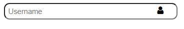
In the CSS document, we have the styles to place the icon inside the input tag by the left.
.form-input {
 position: relative;
 width: 250px;
 }
input {
  border-radius: 10px;
  padding: 6px;
  padding-left: 25px;
  width: 100%;
}
.fa {
  position: absolute;
  left: 10px;
  bottom: 8px;
 }
Output:

Example 2:
In the html document, we have the icon tag and the input tag.
<form>
   <div class="form-input">
      <i class="fa fa-user"></i><input type="text" placeholder="Username" />
   </div>
</form>
In the CSS document, we have the styles to place the icon inside the input tag by the right.
.form-input {
  position: relative;
  width: 300px;
}
input {
  border-radius: 10px;
  padding: 6px;
  width: 100%;
}
.fa {
  position: absolute;
  right: 10px;
  bottom: 8px;
}
Output:
Example 3:
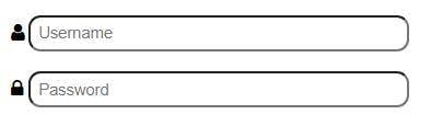
In the html document, we have two the icon tags and the input tags.
<form>
  <div class="form-input">
    <i class="fa fa-user"></i><input type="text" placeholder="Username" />
  </div>
  <div class="form-input">
    <i class="fa fa-lock"></i><input type="password" placeholder="Password" />
  </div>
</form>
In the CSS document, we have the styles to place the icon outside the input tag.
.form-input {
  position: relative;
  width: 300px;
  margin: 1em;
}
input {
  border-radius: 10px;
  padding: 6px;
  width: 100%;
}
.fa {
  position: absolute;
  left: -15px;
  bottom: 7px;
}
Output:
Example 4:
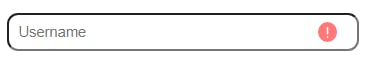
Some icons can be represented as SVG or image files. Unlike font-awesome icons, they are used with the '' tags and are positioned in the same way using CSS position.
To practice this example, download an icon inside the project folder and add its path name to the src of the <img> tag.
HTML
<form>
  <div class="form-input">
  <input type="text" placeholder="Username" /><img src="./icon-error.svg" alt="icon">
  </div>
</form>
CSS
.form-input {
  position: relative;
  width: 300px;
  margin: 1em;
}
  input {
  border-radius: 10px;
  padding: 8px;
  width: 100%;
}
.form-input img {
  position: absolute;
  right: 0;
  bottom: 8px;
  width: 18px;
}
Output:
Below is the output of the above example.
Example 5:
In this example, we have created a login form with icon inside an input elements.
<!DOCTYPE html>
<html lang="en">
  <head>
    <meta charset="UTF-8" />
    <meta http-equiv="X-UA-Compatible" content="IE=edge" />
    <meta name="viewport" content="width=device-width, initial-scale=1.0" />
    <title>Login page 1</title>
    <link
      rel="stylesheet"
      href="https://cdnjs.cloudflare.com/ajax/libs/font-awesome/4.7.0/css/font-awesome.min.css" />
    <style>
      :root {
        --primary-color: rgb(16, 192, 163);
        --second-color: grey;
      }
      body {
        margin: 0;
        font-family: sans-serif;
        background-color: var(--primary-color);
      }
      main {
        background-color: #fff;
        padding: 2.5%;
        margin: 5rem auto auto;
        border-radius: 8px;
        width: 300px;
        box-shadow: 0 0 3px #000;
        text-align: center;
      }
      main h1 {
        color: var(--primary-color);
      }
      .form-input {
        position: relative;
        color: var(--second-color);
      }
      .form-input input {
        width: 80%;
        padding: 15px;
        margin: 8px;
        border: 1px solid var(--second-color);
        border-radius: 5px;
        outline: none;
      }
      button {
        width: 90%;
        padding: 15px;
        font-size: 16px;
        margin: 5px;
        background-color: var(--primary-color);
        border-radius: 5px;
        border: none;
        color: #fff;
      }
      .fa {
        position: absolute;
        font-size: 14px;
        right: 30px;
        bottom: 23px;
      }
      main p {
        font-size: 14px;
      }
      main p a {
        text-decoration: none;
        color: var(--primary-color);
      }
    </style>
  </head>
  <body>
    <main>
      <h1>Login Form</h1>
      <form>
        <div class="form-input">
          <i class="fa fa-envelope"></i
          ><input type="email" placeholder="Email Address" />
        </div>

        <div class="form-input">
          <i class="fa fa-lock"></i
          ><input type="password" placeholder="Password" />
        </div>
        <button>Login</button>
      </form>

      <p>Not yet member?<a href="#"> Signup now</a></p>
    </main>
  </body>
</html>
Output:
Here is the output of this example.